
Increasingly, as Market Research professionals, we find ourselves trying to communicate ever more complex data sets to clients for whom statistics (or indeed numbers in general) are not a first language.
In addition, in an age of increasing information overload in the workplace, “stickability” relies more and more on simplification, thoughtful use of graphical elements, and a clear narrative flow.
For those of us who have been in the industry for a significant number of years, this gradual shift in emphasis from the routine “data dumping” of the ’80’s and ’90’s to the more consultative and narrative approach now favoured has meant we’ve all had to evolve a new set of skills. For this short series of posts, I thought I’d gather together the sources of information I found useful when on this journey. The list is not designed to be exhaustive. It is just what I found useful, by the way.
In this first post I’ll concentrate on the data visualisation/infographic/design resource books I’ve been influenced by, and save online sources, forums, software, utilities etc. for future posts.
So first some books:
(all cover images from Amazon.co.uk – hover over each image to go to the book on Amazon)
Edward Tufte:
Four books from the Godfather of Information Design. Beautifully printed. A wealth of information. He kick-started my love of this area. (The post thumbnail is a photo of a print from Visual Explanations, which hangs in my office at home.)

David McCandless:
London based, and known in the MR community for his work with Kantar, and the Information is Beautiful awards, which you can read about here.


Simon Rogers:
Data editor on the Trends team at Google, and formerly at Twitter, San Francisco. Simon wrote the book “Facts are Sacred” whilst editor of the Guardian’s Datablog
Stephen Few:
Stephen’s books are probably the most practical of those mentioned in this post, and certainly the most instantly applicable in a business environment. Takes the (perhaps more academic) work of Tufte and superimposes it onto a business setting. All you’ve got to do is make it to page 8 of “Show Me the Numbers”, if you want an argument against pie charts and the use of 3D effects in business graphics. Worth the admission price alone in my opinion.

Andy Kirk:
Another Brit, who I discovered through his website (which I’ll cover in part two of this series). This book only came out recently and I’ve not read it yet. However, I’ve heard Andy speak, and I’ve been following him online for years, so I’m expecting this to be excellent.
Alberto Cairo:
Currently reading this, and will update this post when I’ve something useful to add!
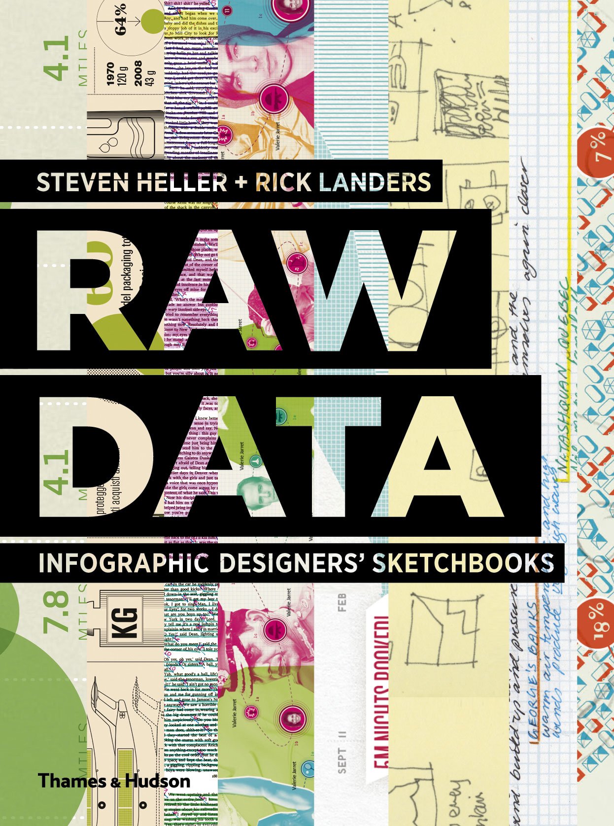
Steven Heller and Rick Landers:
A hugely diverse range of work, from 2D (paper) to 3D (sculpture!) information design, and from heavy reliance on computers to amazing artistic skills, this is a great book to dip into for inspiration.
Stefanie Posavec and Giorgia Lupi
Beautiful book. Got it the day it was published, and it’s sold like hot cakes. It’s spawned copycat projects, an event at the London Science Museum, and the original artwork has now been purchased by MoMA.

In Part Two I’ll look at online resources which I’ve found useful. Meantime, if I’ve missed any books which you feel are glaring gaps in my library, please let me know in the comments.
Sign up below to be notified when Part Two is available:
[mc4wp_form id=”5413″]